These are gatefold invitations I designed for a bridal shower. My client, the groom's mother, wanted to include two adorable childhood photos of her son and soon-to-be daughter in law and created rhyming text to link the images with the invite. Since the shower is to be held at the beginning of spring, I decided to adorn the card with flowering trees and 'love-birds' perched within the branches. I housed the photos within chinoiserie-inspired pagoda 'bird cages' and used vibrant yet sophisticated spring colors. The centers of the flowers on the exterior of the card have a touch of hand-applied glitter for an extra sparkly touch. The invitations were printed on linen-finish paper to complete the chinoiserie look and feel.
3.18.2011
3.16.2011
Design-o-rama
A friend reached out to me to create invitations for her daughter's fourth birthday. Her daughter's favorite books are the 'Llama Llama...' series by Anna Dewdney (available here) and so together, they decided upon a llama theme. Children as well as adults are invited to the party; there will be a real live llama along with other animals from a mobile petting zoo, plenty of South American foods like empanadas and specialty cocktails! Their home will be decked out in papel picado banners which will add a festive Latin flair.
When designing this invitation, it was important for me to consider the perspective of my friend's daughter, a four year old adorable girl who, like many other four year old gals - loves deep pink and purple! She became part of the design process, going over the designs I submitted and selecting her favorites.
This brings me to the most important part of creating anything that I can be proud of — my process. I always begin by listening to my client and what their needs, wants, likes and dislikes are. Meeting in person is an advantage because I can often tell what styles, colors and ideas might appeal to them based on how they present themselves. Then I begin creating; usually a series of three to five differing design directions so that I can help the client really hone in on what they like. After this comes the selection of one design, and its refinement to a final version. Below are all of the initial designs I presented as well as the final, printed version.
![]() |
this version was my favorite |
![]() |
the selected design before refining |
![]() |
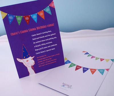
the final printed version. the back was so much fun! |
2.24.2011
long lost circus

![]() |
the design inspiration |
![]() |
envelopes from Paper Source |
2.15.2011
margaritas, mariachis & dinner
What better way to celebrate the engagement of a couple than to throw them a fiesta! My clients did just that, complete with live mariachis, mexican food and drink, and tables draped with colorful sarapes. This invitation captured the mexican flair and was folded accordion style to reveal the theme of the event panel by panel. The font and graphics were kept simple until the actual invite page which has bright vibrant colors. Ai yai yai!
the 'invitacĂon' closed |
2.06.2011
40 years later...
These invitations were for a surprise 40th wedding anniversary party that was being held at the exact same location, and on the same date as the happy couple's original wedding. To capture the feel of the elegant Bellevue Hotel and the wintry time of year, the colors were kept simple — an icy blue, white, a splash of coral — and the printing was on shimmery heavy card stock. A playfully cropped sepia toned photo from the wedding album keeps the elegant graphics from taking themselves too seriously.
Design details carried over to the back of the card |
2.04.2011
Doggone birthdays!
Today is our dog's first birthday. In honor of this being the month Meatball was born, I am going to feature a few more kid's birthday party invitations. The first is for a morning moon bounce party we had in our backyard that included breakfast, beach balls, spin art and face painting, and the second is for a shark-themed party. Happy b-day Meatball!
Kids' pics on bday invites are a great way to track their growth |
Each invite was hand-cut to look as if it was bitten by a shark |
2.01.2011
Fun at Four
There is so much fun to be had at parties when you're a kid! To help set the mood for my son's fourth birthday party, I created this quirky invitation and thank-you note suite. At the party, kids' music was blasting while the sugared-up boys and girls jumped on a giant moon bounce. Once they had exhausted some of their of energy, we had The Great Holtzie http://www.thegreatholtzie.com/ perform his silly kid's comedy act to an audience of happy gigglers. It was a great party, and this invite captured the fun and fabulous festivities for my son's fourth!
Subscribe to:
Posts (Atom)